ACI World Website Evaluation

CLIENT
ACI WORLD
YEAR
2024
SERVICES
UX Design
UX Research
OVERVIEW
A UX evaluation of ACI World’s website aimed at identifying usability issues and recommending improvements for a better user experience.
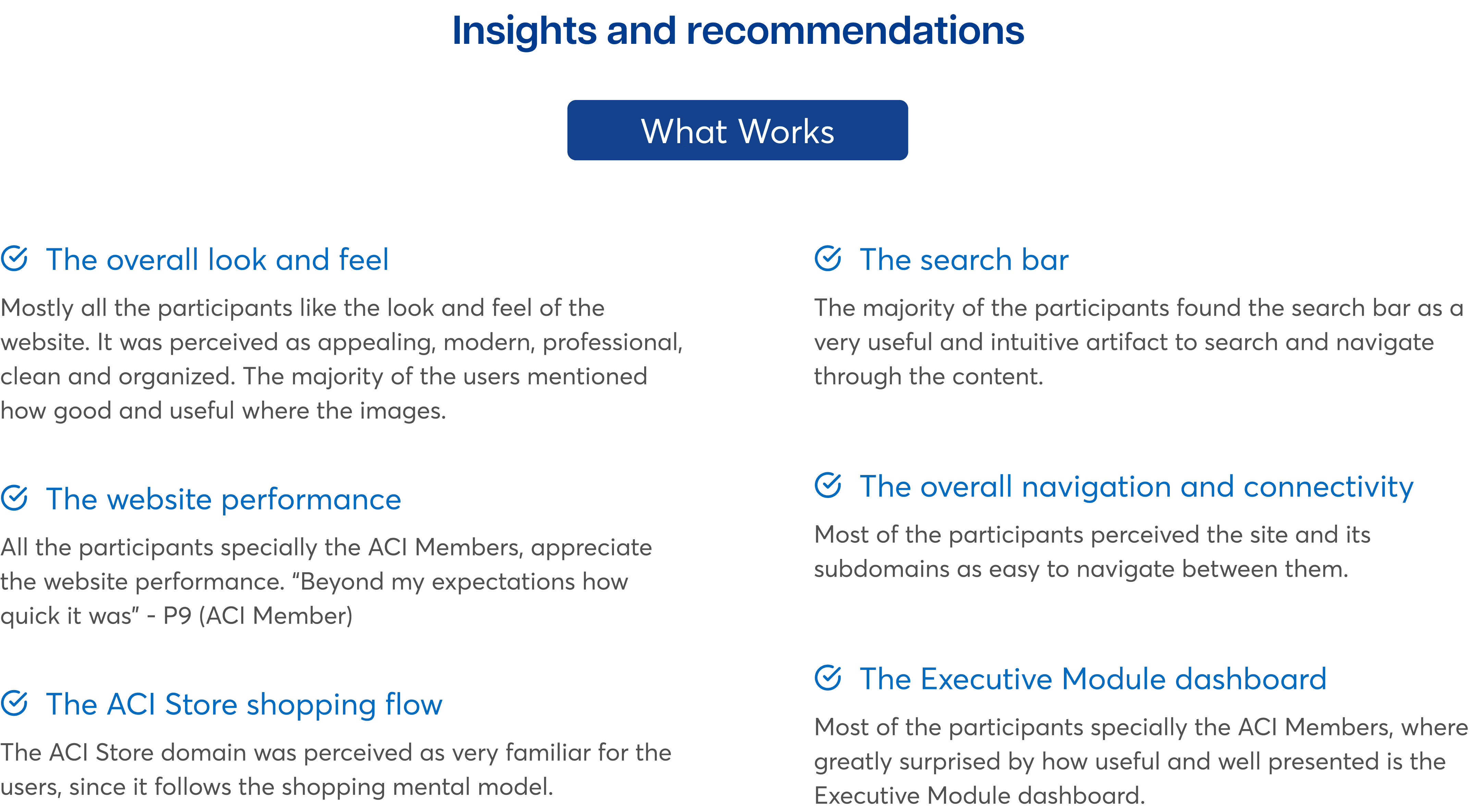
WHAT WORKS
The website is appealing, modern, clean, and organized
Performance is fast and appreciated by participants
The ACI Store shopping flow feels familiar
The global search bar is useful and intuitive
Navigation and connectivity are easy to use
The Executive Module dashboard is seen as useful and appealing
WHAT NEEDS WORK
Confusing CTAs for actions like enrolment and adding courses
Dropdown menus are too content-heavy
Frequent “500 errors” confused participants
The Executive Module naming lacks clarity
Hover hints for store items are unclear
The login process lacks immediate feedback




SUMMARY OF EVALUATION
Overall, the discoverability and navigation through the different services (subdomains) of the ACI digital ecosystem was perceived as easy by the participants. However the ACI World users might be benefited by improving the previously mentioned usability issues.
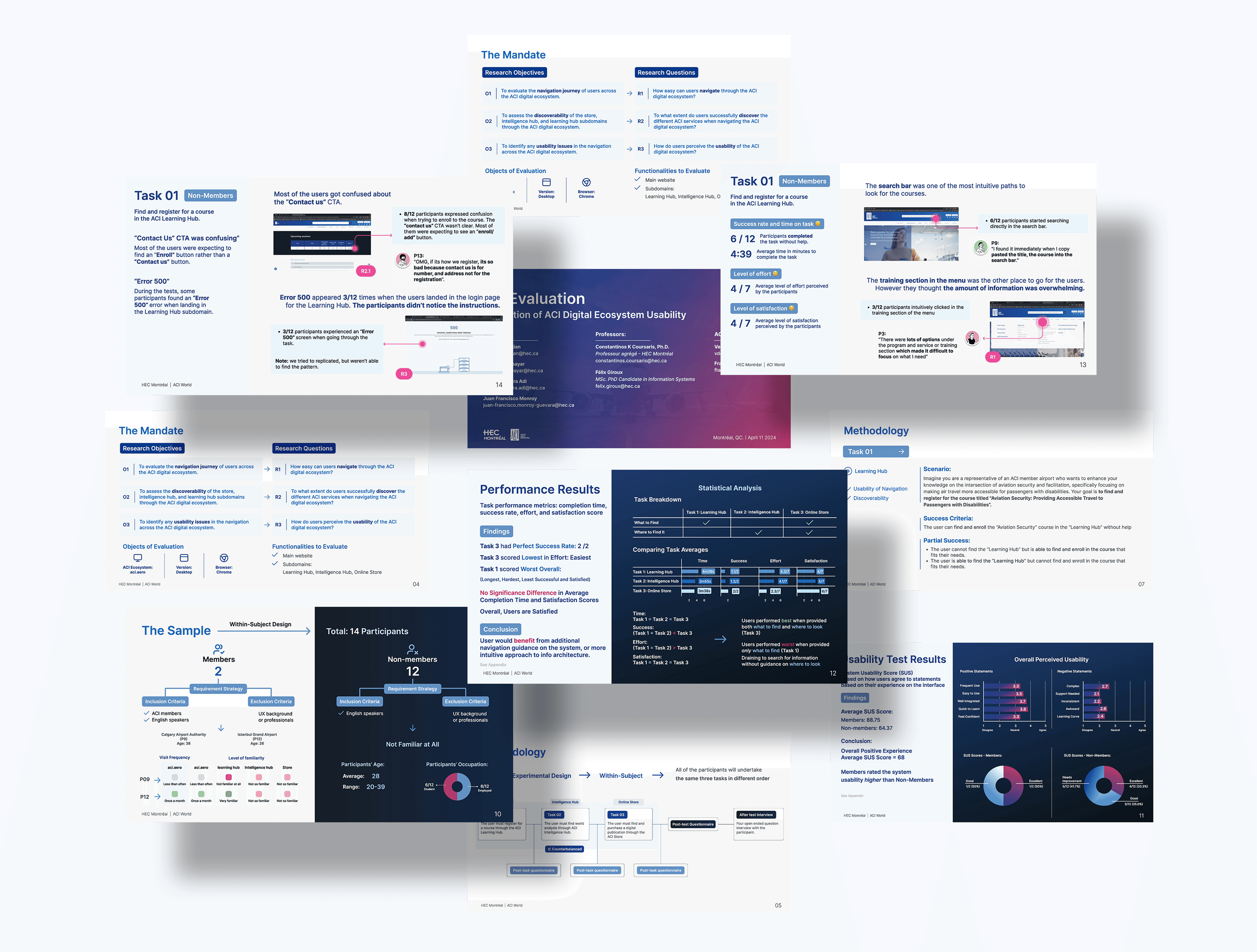
According to the System Usability results, the participants perceived the ACI digital ecosystem as standard.
NEXT STEPS
Implement by priority the items recommended by the UX evaluation team.
Run a benchmark test to compare results after the improvements’ implementation (Ideally with ACI members).