Webinar Landing Page

CLIENT
ERPsim Lab
YEAR
2025
SERVICES
UX Design
UI Design
OVERVIEW
TARGET AUDIENCE
Drive webinar registration by clearly communicating value, simplifying information, and building trust.
DESIGN PROCESS
Structuring for Conversion
The page content was reorganized into a clear flow to help users quickly understand the value of the webinar and move toward registration. Each section was intentionally sequenced to lower cognitive load and guide professors from awareness to action with minimal friction.
Information Hierarchy Decisions
Complex, text-heavy content was condensed into short, scannable sections to make the page easier to read.
Highlights were reduced to concise value points, panelists were grouped by organization for clarity, and form fields were simplified to feel approachable while still capturing necessary data.
Visual Design Choices
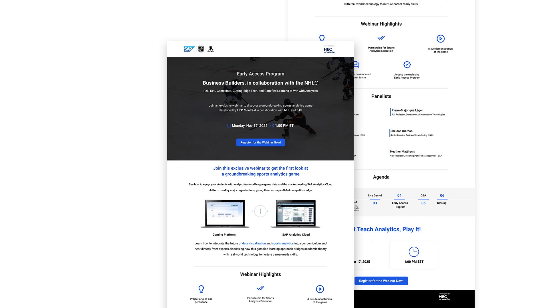
A clean, neutral UI was created to balance the NHL, SAP, and HEC Montréal brands, using a structured grid, high-clarity typography, and spacious layout blocks.
The hero logo trio, dashboard visual, and consistent spacing worked together to build credibility and support the page’s academic tone.
Designing for Mailchimp Constraints
Because the final page needed to be implemented in Mailchimp, the high-fidelity design was adapted to match the platform’s limited spacing, typography, and layout controls.
DESIGN DECISIONS
The landing page design used a GIF of an NHL game in the hero section to immediately convey the energy of the sport and connect viewers to the theme of real hockey data.
A blue and black color palette, aligned with SAP and NHL branding, was chosen to reinforce trust and credibility.
Simple line icons in different sections supported quick scanning and helped break down dense information.
FINAL OUTCOME
Figma Design (High-Fidelity):
Live version used for the webinar campaign: (MailChimp)
Webinar Presentation Slides
The webinar presentation deck was designed to match SAP’s visual standards, using consistent colors, spacing, and typography:
